KIẾN THỨC
INTERIOR COLOR TRENDS IN 2021 IN HOUSE DESIGN
18/04/2022
The year 2020 is gradually closing with far-reaching and complex changes around the world. 2021 begins as a "bright spot of hope" for the global economy. In particular, in the field of residential architectural design, interior color trends in 2021 also have a strong change. From bright colors, full of energy and vitality, to more neutral, natural and warm tones, expressing the value of the natural world to human life. What's the difference? Which interior color trend in 2021 will become the "focus" of the design world?
1. MAGIC COLOR OF 2021: SUPERIOR GRAY AND BRILLIANT GOLD on the throne
If in 2020, Pantone Color Institute launches classic blue – Classic Blue stirs up the design world with the meaning of connecting people closer together. Then the interior color trend of 2021 will be even more special, Pantone did not choose 1 color as usual, but announced the decision that the chosen color set is a combination of 2 colors PANTONE 13-0647 Illuminating (Golden) and PANTONE 17-5104 Ultimate Gray.
Yellow and Gray are the two main colors for 2021 that were officially announced by Pantone Institute on December 9, 2020.
According to Pantone, Illuminating is likened to a ray of sunshine with a bright yellow color, bright but also extremely warm. Ultimate Gray is a neutral gray that reflects the tumultuous landscape of the past year. Besides, gray is also a symbol of a solid foundation, encouraging stable, calm, enduring emotions and also has a gentle reassurance. Although these are two contrasting colors, when combined, they create a sense of strength, hope and optimism for a brighter future.
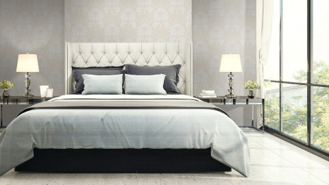
The perfect combination of Yellow and Gray tones creates a stylish kitchen for your home. With the dominant yellow color, LG solid surface artificial stone surface with color code S026 (Banana) is also a good suggestion for those who love the "hot trend" color of the year!
2. Idyllic and warm with earthy beige tones
Interior color trends 2021 always promote simplicity but also modernity. Not only Pantone, but color experts from the famous paint company Dulux have chosen the interior color of 2021 which is a earth beige Brave Ground tone. This is also a neutral tone chosen by many brands as the main color of this year, such as the world famous paint company Sherwin Williams who has just released the main interior color palette of 2021 Urbane Bronze - Deep earthy beige color. As a warm and balanced color, connecting people with nature, with the simplest things, helps us feel peace and calm for the spirit, gives us the strength to cope with change. change of the world.
"Brave Ground" has been selected by Dulux as the main color of its 2021 "Urbane Bronze" – The deep, warm earthy beige color is also a perfect color, helping to connect people with nature. , create a modern space for you.
Beige is the perfect neutral color so it can be easily combined with other tones. You can use earthy beige to create a background for a space and combine with other neutrals like cream, brown, gray and wood, rattan or wood grain furniture and decorations. rustic to increase intimacy and create a more cozy feeling.
Or you can bring nature into your home with this earthy hue, try balancing earthy beige with blues or greens, add some indoor plants and some ceramic decorations. beautiful design, will create a fresh and modern feeling, connecting nature with human living space.
Also thanks to its versatility and versatility, beige is considered as the interior color trend of 2021 in housing design, because it is easy to combine and enhance other colors subtly, creating accents. , helping color coordination always "fit" in every space.
3. GRAY CRANIAL - THE COLORS OF PEACEFUL MOMENTS
Interior color trends for 2021 are shifting to calm, gentle tones that are in harmony with nature. Besides Pantone, the famous American paint company Benjamin Moore with an age of 138 years has also announced their main color for 2021 which is Aegean Teal – turquoise gray cool, quiet.
Aegean Teal – cool gray turquoise is one of the interior color trends for 2021 that has been selected and released by Benjamin Moore paint company.
This is a balanced, gentle color that is beautifully blended between blue and green and is softened by a bit of gray, creating an elegant and simple elegance for the interior space.
Studies have shown that color has a direct effect on human mood. With bright interior colors will help people have a better mood, more positive thinking. As for the main colors for the interior are gentle, soothing tones that will make people relax, comfortable and calm. And as we spend more time at home, we become more drawn to the emotional connections between the house and the colors around it. The most important thing is to create a warm and friendly space.
Gray turquoise brings a feeling of lightness, calmness but also enchanting with gray tones. Besides, the green color shows us warmth, balance of life, seems to be "reminding" people to always live for the present and capture every moment that is happening in front of their eyes.
Turquoise gray is one of the colors representing interior color trends for 2021, with the spirit of promoting connections with nature and preserving each successive moment in the house. This is also a peaceful, cool color that helps people to be more confident and optimistic in life.
4. Terracotta color – TRADITIONAL CHARACTERISTICS WITH MODERN
Color is a key tool for artistic expression. It brings ideas to life, evokes many human emotions. Terracotta is one of the colors introduced by Jotun paint company - from Norway - in their new "Rediscover" collection in the New Year of the Ox. This will definitely be a interior color trend of 2021 that is well received by many designers.
Terracotta colors - rustic, warm colors are inspired by the colors of clay, bricks, and tiles - the main materials that create a living space for people.
Terracotta is a set of colors mixed by a combination of earthy brown with orange, yellow, red or dark pink, creating shades of terracotta such as brick orange, terracotta red, or ocher yellow. fired…
These are rustic, warm tones, inspired by the colors of clay, sand, tile, and brick – the main ingredients that make up the homes and cities that are important in our lives. With the message of living slowly and enjoying life with all your senses, the terracotta palette connects people to all things around.
Whether you use these colors for a small, cozy space to relax and daydream, or apply them to decorate an entire large interior space, these colors bring us to those moments. simplicity of life with a rustic, peaceful setting, evoking memories of traditional architecture, heritage or cultural quintessence alongside the ingenuity of skillful artisans' hands. Anyone who has ever traveled to the land of a thousand and one nights morocco or the land of Mexico, will find it difficult to resist the legendary beauty of the ancient Arab architecture with the blend of 2 tones of terracotta and color. turquoise, is likened to the color of the earth and the sky in the desert.
5. MINTIAL BLUE - BEAUTIFUL PASTEL COLORS TO "SUPER LICENSE"
Interior color trends in 2021 are pastel colors but leaning towards vintage, specifically mint green. This is a very special color, combining colors that evoke nostalgia but still have a hint of the future.
Mint green is one of the 2021 color trends that have been popular in the last 2 years.Basically, green shades such as mint green, butter green, moss green, etc. always bring a relaxed and pleasant feeling to the installation space. Not only highly aesthetic because it is a fresh, cool, pleasant color, but also has the ability to treat and support psychological problems, "honor" the feeling of peace, lightness, bring a sense of peace and harmony. nature closer to human life.
With its lightness but no less modern, mint green will make many homeowners "fascinated". You can easily connect mint green with white, beige, brown, ..indoor furniture.
If your living space wants to have a brilliant kitchen according to the interior color trend of 2021, you can choose kitchen cabinets with mint green tones, or add a little gray to create an irresistible attraction in the interior. The perfect combination of these two bright and bold shades.
Blended with white, blue and yellow, mint green goes well with cold palettes, making designs feel warmer and more intimate. Along with that, mint green is also very suitable for those who want to use artificial stone for kitchen countertops because it will highlight the gray vein design of the stone. Besides, the lightness and freshness of mint green tones can also be combined in Scandinavian style, monochrome or become more innovative with the color block scheme.
Other